
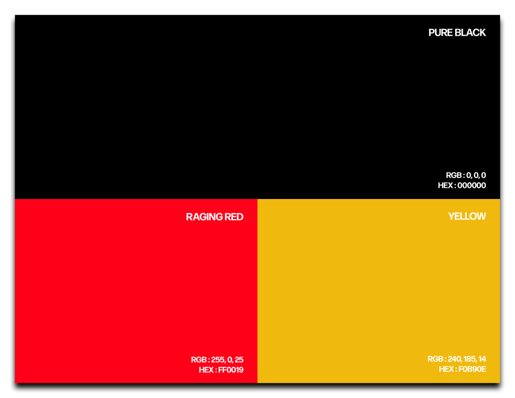
When using a red, yellow, and black color scheme, it’s important to consider the proportions and distribution of each color. Using too much of one color can dominate the visual experience, while using too little might dilute the intended impact. Balancing the colors effectively can help create a harmonious and visually engaging design.
The logo features a stylized representation of a parasite, wrapped around the letter P. The design captures the essence of a parasite without being overly detailed or grotesque.
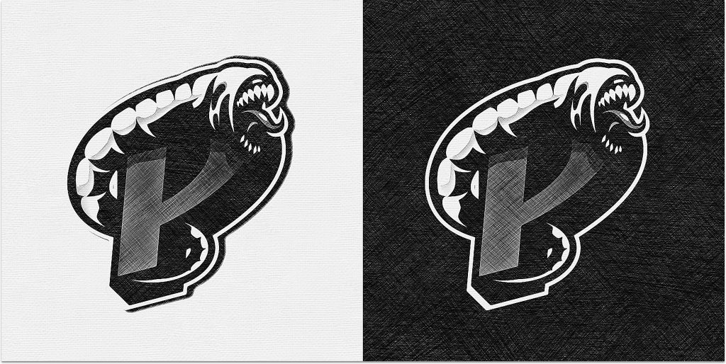
The brand consists of graphics that are striking, and visually appealing, while also maintaining a sense of simplicity, and minimalism. Parasite did not want to overwhelm his viewers with over the top designs.


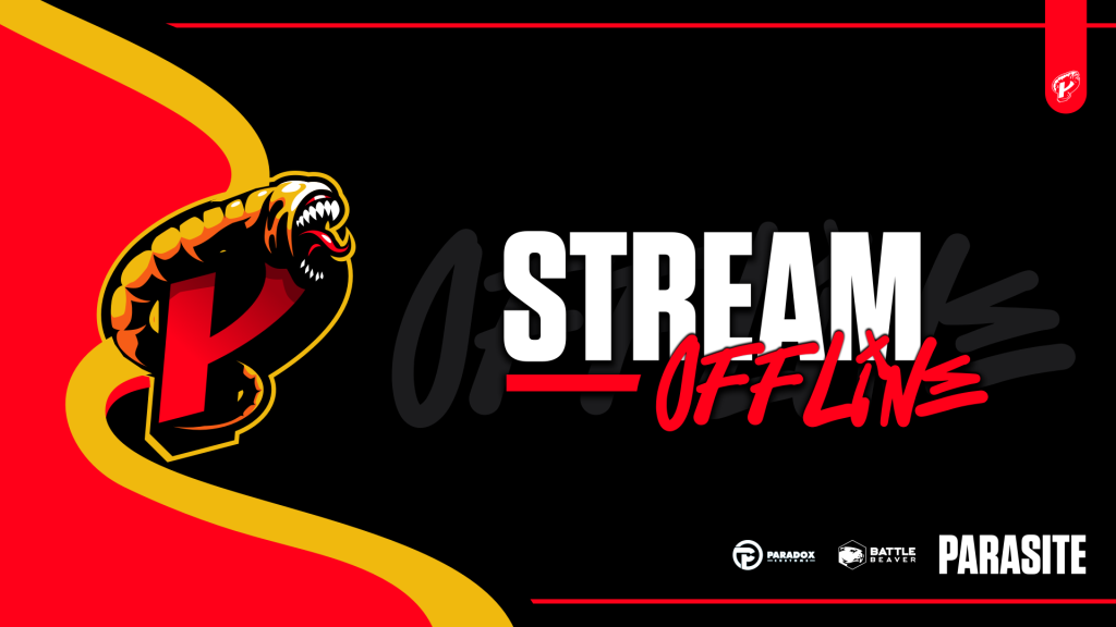

When used together, black, red, and yellow create a high-contrast and visually stimulating color scheme. The combination of the intense red and the cheerful yellow against the dark backdrop of black creates a sense of drama and draws attention.
When used together, black, red, and yellow create a high-contrast and visually stimulating color scheme. The combination of the intense red and the cheerful yellow against the dark backdrop of black creates a sense of drama and draws attention.
About Us
Contact Us